How-to Select the Perfect Colour Palette for People in a Hurry!

Photo by Luca Ambrosi on Unsplash
Have you ever found it confusing to choose colours for a creative project? God! I’ve obsessed over this! Which led me to stop and think, how should I move forward to really simplify this process?
I’ve narrowed down 3 strategies to solve the colour palette conundrum. The best part?
They’re simple to implement and you’ll be matching colours like pro in about 7 minutes!
#1 // Know Your People
Before anything else happens, ask…
Who are you serving?
Women? Men? Kids? Hip Hop music lovers? Retirees, that like to paint?
For example, let’s say you’re in the process of branding a new business and you’re picking colours for the inspiration board. Let’s also say your business is a curated vintage shop located on Broadway Avenue in Saskatoon. It’s called Ashworth Vintage (named after your Great Uncle Ashworth). You plan to serve young women aged 14 to 24. This group hangs out on Instagram online, is attending high school or university, enjoys travelling, hanging with the girls, and wants to make a change in the world. What that is? They don’t know quite yet, but supporting sustainable and ethical boutiques? That’s their jam. And one avenue that feeds this aspiration.
Through this information we could discern:
This group overlaps between generation Z and millennials.
They expect a high level of taste and curation. In other words, sub-par styling is not going to cut the mustard.
They tend (but, not always!) to follow colour, style, and shopping trends. And count on Instagram to keep them up to date on fashion, trends, and shopping.
Through this brief analysis, we could confidently predict that this group would vibe with millennial pink. So, it should definitely make an appearance on your inspiration board.
Let’s take a closer look at millennial pink.
Take this quote comes from an article in ManRepeller:
“According to a retrospective published in New York Magazine, the term “millennial pink” was coined during the summer of 2016, when Véronique Hyland penned a story for The Cut originally titled, “Is There Some Reason Millennial Women Love This Color?” At the time, no one could have predicted that term would rise to the top of our cultural lexicon and remain there for years…”
Instagram culture and millennial women seemed to have decided en masse—“we like pink”.
The point of all this? Know as much about your customer as possible! But, please no stalkers.
This will help you choose colours more thoughtfully and strategically. Are there colours that your target audience gravitate towards while aligning with your brand experience? If yes, then you’re likely on to something.
Knowing your ideal customer inside and out will help you identify cultural tendencies, such as colour, that speaks to many and should be considered when choosing colour palettes for branding, campaigns, and graphics.
To wrap up this first strategy here’s BadGirlRiRi in millennial pink!
#2 // Get to Know the Colour Wheel
Things get more technical now. (Cue vigorous, slightly off-putting hand rubbing.)
To kick this off, here’s a version of the colour wheel. Please note, there are several different version out in the world!

We can learn a lot from this image.
The colours you see above are literally based off of a rainbow you would see in nature. #TruthBomb
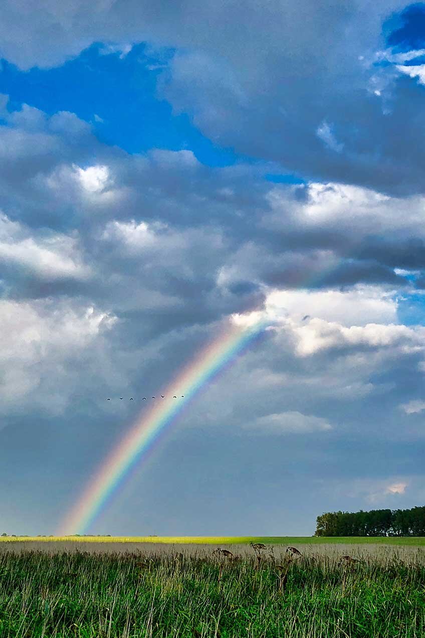
Photo by Leo Wieling on Unsplash
For those unfamiliar, rainbows follow this acronym: ROY G BIV.
Red / Orange / Yellow / Green / Blue / Indigo / Violet
Now, if you scan the colour wheel above you’ll notice that the colours on the wheel mimic the colours in the rainbow itself. Pretty cool.
The colour wheel is also built using primary, secondary, and tertiary colours. I highly recommend you also read this article on Colour Theory from CoSchedule to dive deeper into this topic. Anyone working in marketing, social media, digital marketing, etc. should understand this theory. It’s also just a good read if you’re interested in colour.
So, how do you apply this information to develop a colour palette?
A strong colour palette can range from 3 to 7 colours. Comfortably. Although, I’ve seen people use more than that or less. However, the simplest and quickest way to group palettes together follows either of these two options:
Monochromatic
Essentially you select colours that are part of the same colour or are very closely located on the colour wheel. For example, grouping different shades and tints of yellow, or, grouping different shades of purple and blue would be considered a monochromatic palette. The colours tend to blend together without any real POP or intense contrast.
How do I apply this?
If you need a colour grouping that flows smoothly, I would suggest a monochromatic palette. The example below is from a campaign I co-directed with Kate Matthews in 2015 for Saskatoon Fashion & Design Festival. The result came off as luxurious, refined, and elegantly relaxed, which in fact was the theme of the campaign. This demonstrates a subtle monochromatic palette in action.
Complementary
Complementary colours are opposite colours found on the colour wheel and they bring out the other vibrancy. You’ll notice that the intensity of both colours is enhanced when placed beside its opposite. As you become more conscious of colour palettes, you’ll notice many companies use complementary colours in their branding elements.
How do I apply this?
When developing the campaign scheme for the 2017 SaskTel Saskatchewan Jazz Festival I choose purple as the predominant colour. (The full concept involved a “universe theme”, which I’ll tell you more about in a different article.) As part of the advertising plan, I used decals on yellow taxicabs, which brought this complementary colour theory to real life. Check it out below.
This example demonstrates how colour palettes in advertising action can really work for you and draw attention, which did happen in this case. This strategy would also lend well to the digital space, and I find draws more immediate attention.
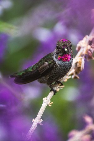
#3 // Take Your Inspiration Directly From Nature
The first two strategies are based upon cultural tendencies and basic colour theory, which are very smart and strategic ways to build beautiful and results-driven palettes, brands, and campaigns. However, for those projects that go deeper than theories, strategies, and best practices, Mother Nature is the ONLY place to look for colour palette inspiration.
I first became aware of this truth while in design school in Montreal. My illustration professor said, “forget fashion magazines with visual clutter. Books on nature, animals, birds, landscapes will always deliver the best possible colour inspiration you can find.” The header image for this post should make a lot more sense now!
That professor also encouraged us to always be reading all kinds of books, frequenting museums, parks, attending gallery shows, experiencing nature as much as possible, and travelling!
Doing this keeps your mind attuned to our world and feeds your imagination. Social media, traditional media, and digital content I believe can be interesting, educational, and inspiring (like this post!), but it doesn’t tend to feed our imaginations in the same way.
The knowledge I’ve provided will certainly help, but when the time comes to really figure this puzzle out take yourself Offline—with a capital “O” and get to know the inhabitants that fly, crawl, and gallop!
When I conceptualized the campaign for the 2016 SaskTel Saskatchewan Jazz Festival, I pulled colour inspiration from the long summer nights and stunning sunsets in Saskatoon. The result was not only a beautiful campaign but an award-winning one at that!
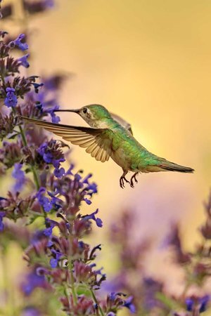
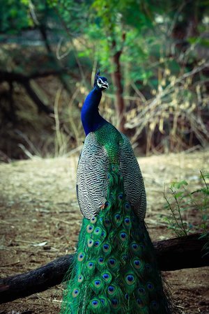
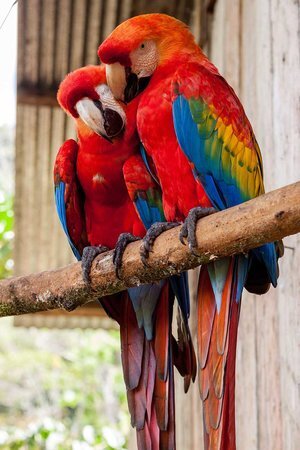
And to help you prepare for that day when you take yourself offline and build the most perfect colour palette… take these beauties with you!


Before we part, I want you to keep in mind these key takeaways from all the info we’ve covered:
KEY TAKEAWAYS
Know your people and their tastes.
Colour palettes are usually 3 to 7 colours. You can of course do more or less than this, but I’ve always used palettes in this range and achieved success.
Study the colour wheel so you understand primary, secondary, and tertiary colours.
Become colour palette conscious. Start to notice colour palettes around you in public spaces, magazines, stores, parks, your closet! These will train your eye to look for appealing colour combinations and cultivate your taste.
Call on nature for the best mix of colour palettes, EVER. No one does colour and pattern mixing better than Mother Nature. Get yourself books on nature, landscapes, space, or my personal favourite, anything bird related! Birds produce the best colour palettes I’ve ever seen.
And there you have it. A 7 minute lesson on planning colour palettes like you went to Parsons for 4 years.
Ah Badabing!
(Forgive me, I’ve recently started watching the Soprano’s.)
XO,